The negative space (or white space) has a very important role in photography, logo design, magazines, arts in general, and it’s no different for web design.
I like to compare the white space on the web to the silence we need between blocks of messages we speak. If you speak without a pause, the information transmitted will overwhelm the receiver. Everything will seem to be the same data while it’s not; also hearing an oratory without pauses is very unpleasant. The same occurs for visual communication.
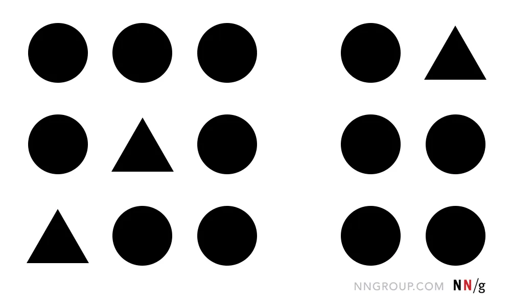
The Gestalt Law of Proximity explains clearly how our brain understands the elements positioned near each other as part of the same group. So, the opposite of that, separated elements tell our cognition that they are unrelated. Based on this, we may know that elements or sections with incorrect white space will transmit a wrong message.
This type of understanding happens in milliseconds and as you probably already heard, the human’s attention span average is not that much in general and according to a Microsoft study in 2015, it dropped to 8 seconds and it seems we can blame the digital world for that.
So you can imagine how fast a user scans web content looking for what they want to do. Some factors count to make them interested to continue using what you offer them, for example, readability, visual symmetry, color balance, etc. It’s not a choice, but humans are much more attracted by harmonious visual systems.
The usefulness of white space
For texts, micro white space between titles, lines, and paragraphs is essential for the user’s reading comfort.
Negative space between sections is essential to define when it starts and ends. In the images above, the first has text too close to each other, while the second makes the readability easier with increased white space between the paragraphs.
As we observed in the Law of Proximity, the size of the white spaces plays a crucial role in defining elements within the same group and distinguishing them from different groups. And that’s what we can check below.
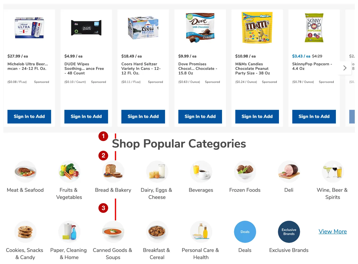
The image above is part of an e-commerce homepage. There are 2 different sections. The first is with the product grid and the second is with the e-commerce popular categories. The title of the “Shop Popular Categories” section has a smaller white space (1) between the non-related section above than between the elements of its own section (2). Also, the white space between the lines of the same category (3) is much bigger than the top margin between one section and another. In this case, the user would only identify each section because they have totally different element types, but depending only on the negative space, it would not be clear.
The image above shows 2 sections. The first one with 3 advertising and the second with popular categories. The white space between each section (1) is the biggest and the white spaces inside of the categories section (2 and 3) are smaller. This way, it’s clear where a section finishes and starts another.
So beyond the understanding issue, the lack of white space used correctly can make the screen less attractive and it means reduced engagement.
Negative space for luxury concept
Have you ever noticed that in luxury physical or digital spaces, the few elements exposed are carefully positioned with a lot of white space around?
The luxury concept puts the product to be the “queen” of their own space and it works. Elements with macro white space around will be highlighted, so the message receiver will focus on the product and its detail. The quantity of white space used for a brand can define the quality and price they propose.


In a summary
In design, it is crucial to recognize the significance of negative space and give it the attention it deserves.
Negative space refers to the empty or unoccupied areas surrounding and between design elements. Instead of perceiving it as mere emptiness, consider negative space as an essential element in itself.
Just like any other component of design, it holds the power to enhance the overall composition and impact of your work.
You embark on the right path toward creating a successful design by consciously acknowledging and leveraging negative space.
Related Posts
September 10, 2022
Don’t Be Fooled. You Have to Tolerate Customers Errors
Why will you spend time creating similar products without the compassion touch…
September 7, 2021
Memory: Either Work With It, or It Will Destroy Your Design
Understanding how customers use their memory to operate tools is essential.


