In 1994, the Dental Office was one of the most innovative software to manage clinics in Brazil. However, more features were added to it over time, and it became increasingly complex little by little. When it changed from a desktop to an online platform, it brought together all the difficulties of use to this new format.
The current interface confused the users, resulting in a lot of support requisition, which impacted the necessity to hire more and more people to support users in doing simple tasks that they should do by themselves. Also, clients were feeling upset and discouraged about using the tool, some of them had canceled the contract and others indicated that they would soon go to a competitor’s platform.
Strategic Objectives
1. Improve user satisfaction
2. Decrease expenses with the support team
Client
Dental Office
Year
2019
My Services
UX Research
Interaction Design
Roles Involved
This project had me as UX/product designer, and a full-stack engineer. It was great the exchange knowledge shared between the engineer and me. We complemented our necessities very well.
We worked on this project as freelancers on the Workana platform.
I kept direct and regular contact with the internal team of the Dental Office. They were the CEO, customer support manager, visual designer and marketing coordinator.
My Assignment
In my role, I had to understand the users’ pain to make clear what needed to be changed. I was responsible for concept sketching, prototyping, and testing.
Also, I did the kick-off process for the visual designer who created the high-fidelity pages. And I gave support to the visual designer and the engineer when necessary.
The biggest challenge of this project was to determine the key features to be redesigned in a robust platform. Immediately bringing a relevant improvement to users.
The Beginning
To start this story, I scheduled meetings to gather as much information as I could from the stakeholders. This way, I understood the whole picture and got a clearer idea of the problems their business was facing.
They explained that their software had a lot of changes and additions of new features over time which made it become a complete tool but, at the same time, harder to use.
This caused the demand for support to increase, which drove up expenses. Clients were abandoning the tool and choosing another competitor’s platform.
What Do the Users Have to Say?
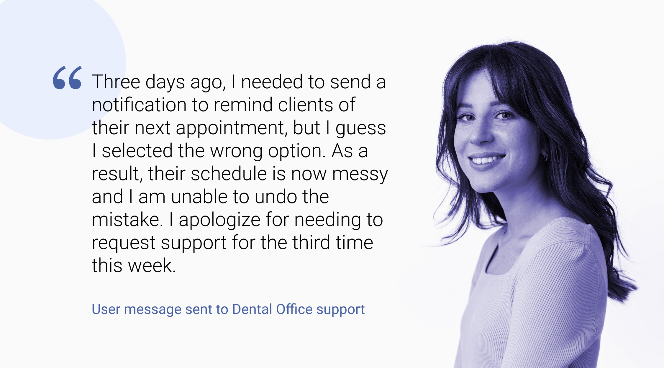
I collected tons of qualitative comments received by the company through support tickets and phone registration notes to understand the difficulties the users were facing.
There were a lot of messages, and I needed to limit myself to digest just part of them, which was more than enough for the moment.
I coded the messages I analyzed and identified repetitive themes that allowed me to focus on the biggest problems they were having.
A curious but not rare point was that users’ comments demonstrated that some of them were not confident of their abilities with technology, and they thought that it was the reason for not accomplishing the task.
Who's to Blame?
Users were feeling guilty that they were not able to use a tool that was not friendly. They were guilty because of a wrong perception of what was happening.
Other users were upset, most of these users were the clinic owners, and they were demonstrating their will to move to another platform. They felt that their organization was impaired because they were taking too much time to accomplish their most common tasks, and the work was piling up.
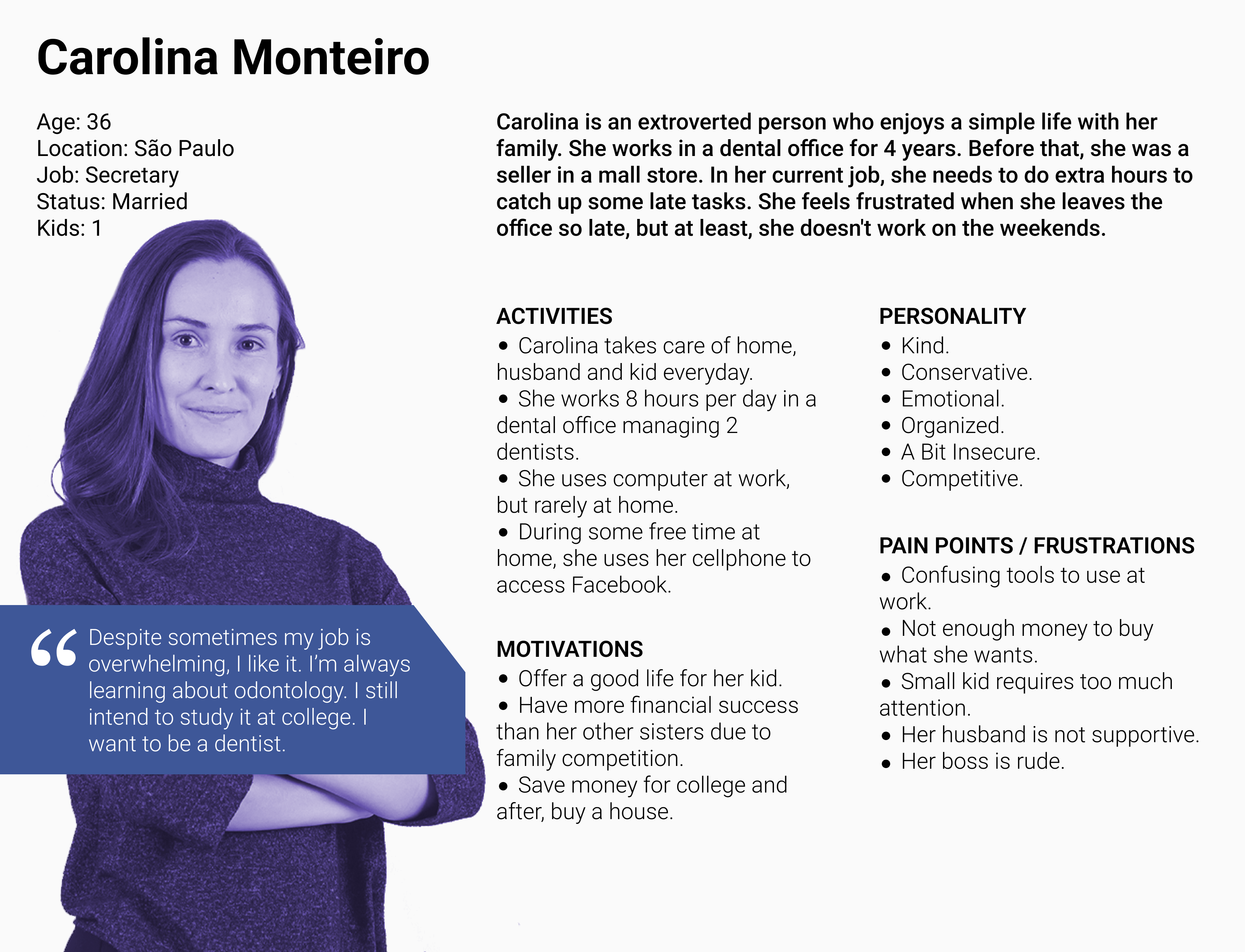
Even though they had a lot of respect for their customers, Dental Office still didn’t have the initiative to know more about who their real users were and build a Persona to understand their direct needs. They were not only business people and dentists.
Based on that, I thought that it would be very useful to learn more about Dental Office’s users to make myself and the stakeholders be more empathic with them.
Also, from my analysis of the qualitative comments, I took note of some repetitive behaviors, and I came up with questions to ask the users because I needed to understand the process as a whole, and some parts were missing to assemble the puzzle.
So I showed my ideas to the stakeholders, that accepted them easily and then I moved to the next step.
Talk to people!
Talking to Users
I did quantitative and qualitative research to gather enough information to build a consistent Persona. First, I created a quick survey focused on demographic aspects that they didn’t have either. We sent it to all their registered e-mails, making it clear that the formulary should be filled out by people who use the product directly.
After that, I interviewed 10 real users invited by the client. The process consisted in asking questions about their experience and sharing screens to discuss the process steps. I requested them to perform some tasks during the process, thinking aloud what they normally think when they are using the platform during work.
Except for data reports visualization, tests prescriptions, and medicine prescriptions, most of the other tasks were not performed by dentists or office owners but rather by secretaries.
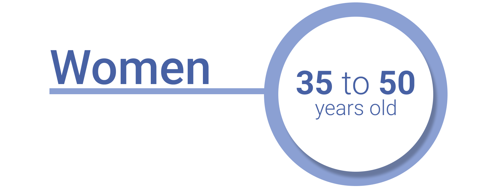
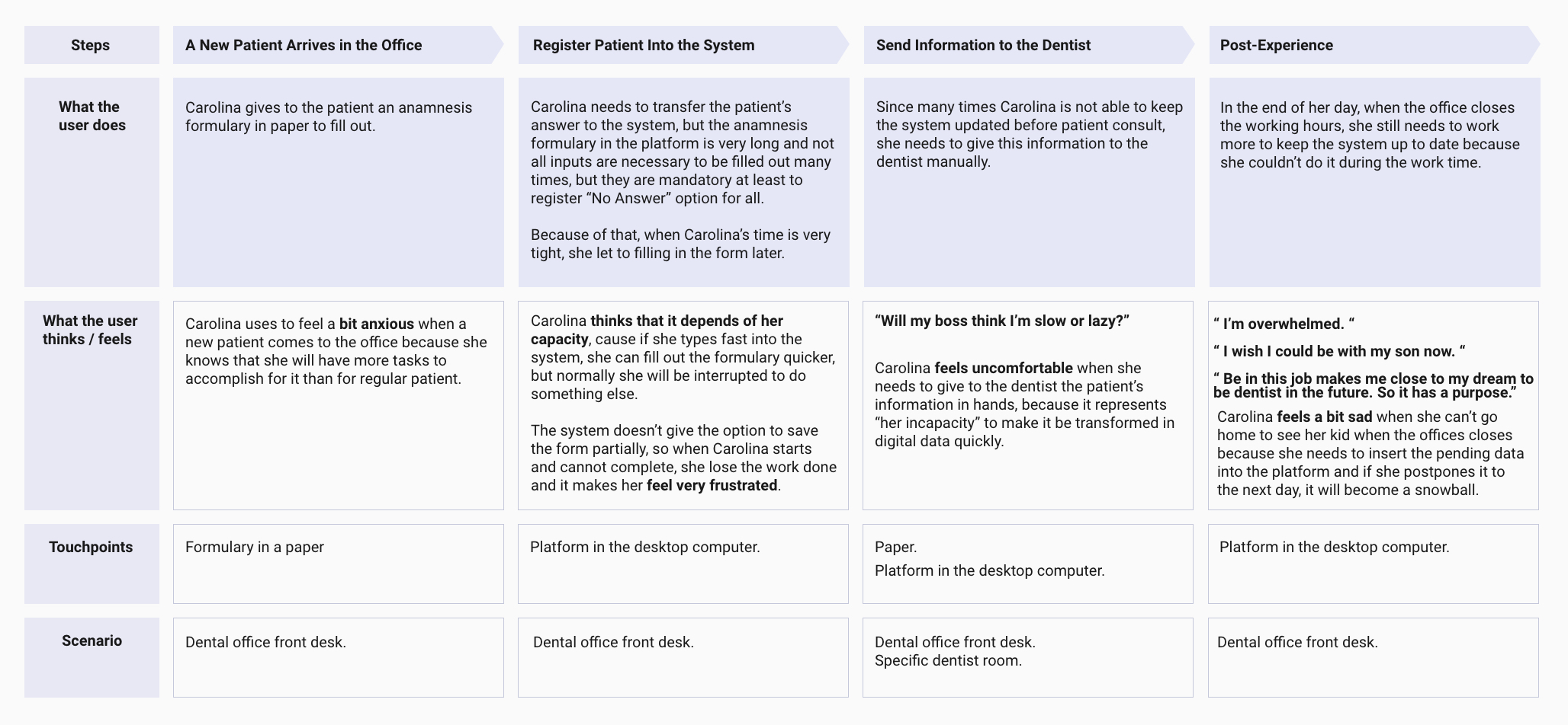
Most of them were women, average age from 35 to 50, and many of them showed what I already felt before when I was reading the feedback messages sent by users during the prior year. They were feeling that they were trying to use a tool that was way too complex and sometimes they didn’t feel prepared to perform their job properly.
Also, some subjects clarified that the steps of the procedures were not exactly complex but time-consuming, and when they were attending to patients, they didn’t have enough time for them.
Some users used to have a notebook to make notes, and when the workday was concluded, they would enter all the pending information into the system instead of doing it before during customer service and saving a lot of time. 😮
For new dental clinic employees, it was difficult to find what they needed and get used to the path of the features.
From this user research, I came up with 2 documents:
As an activity with Dental Office key stakeholders, I moderated a workshop where we put into practice Affinity Mapping. I created a lot of post-its with quotes and observations from clients’ feedback in the Miro board and we all together created clusters that shared specific themes.
It was nice to do this process with them because they started becoming more aware of the findings. With my moderation, they were better at interpreting what clients’ comments meant and they also shared their insights with a more technical perspective in the dental niche.
After these processes, I synthesized the data and created a report with thoughts and their respective arguments. Through the analysis, I identified 2 key issues that, if addressed, could greatly enhance the software’s usability.
1. Most frequent tasks were not quick to find.
2. Registration processes were not fluent, with long and not well-structured formularies, also without a proper save feature.
After putting together this information, I transformed them into a presentation to show to the clients the insights of this research as a whole, to generate empathy for the users and possible actionable ideas.
It helped me gain alignment and drive decision-making. It helped them open their minds to a new perspective about the users.
As I already mentioned, they were very respectful with their clients, but at that time, they realized that since the beginning of their project, they focused a lot on the business interests and almost nothing on finding solutions to fulfill the user’s needs, in some way, they brought unnecessary additional tasks for the end-user.
With this learning, they pledged to continue with the UX cycle after the end of this phase and keep tracking and understanding more and more about their users.
A New Structure for a New Experience
After receiving positive feedback from the client, I created the wireframes to define the new structure of the pages to properly accommodate the new approach we hypothesized.
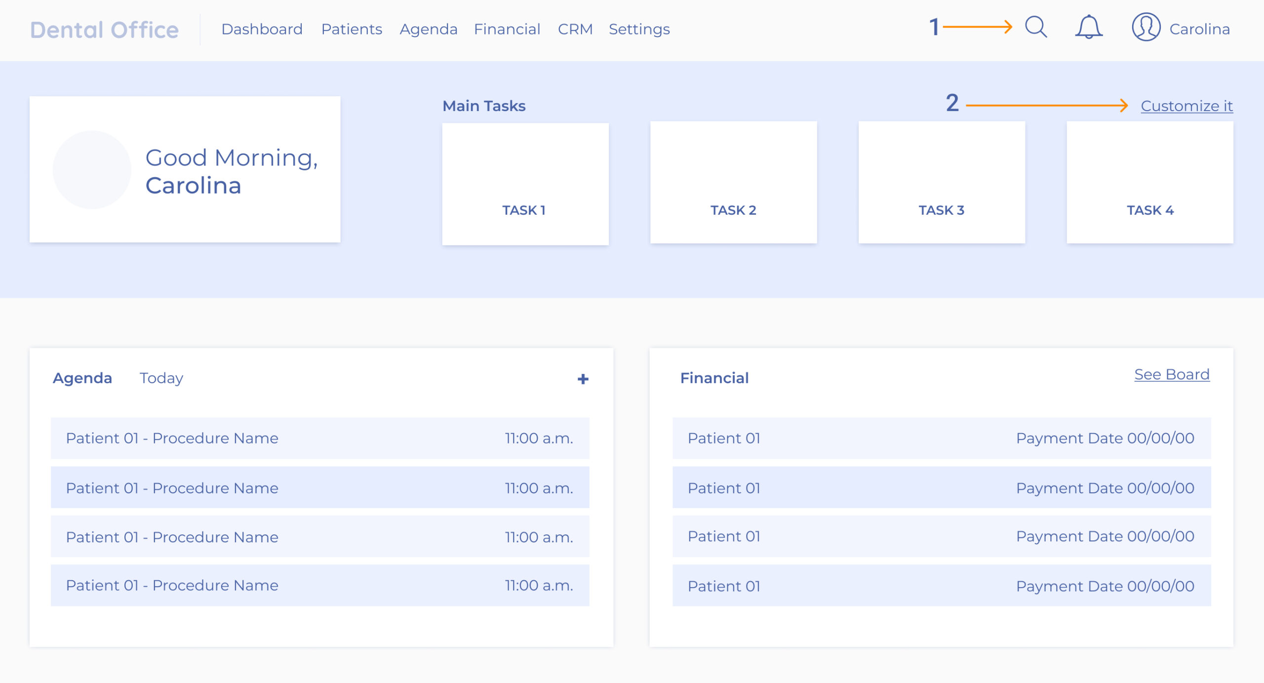
MODIFICATION 1 – Use of accurate search functionality to help find tasks.
The main menu had a lot of subcategories. The search comes to support it and helps the user find the category they need quicker. Also, the concept to relate some terms to others similars were considered. This way, users can find what they want also with synonyms. In the future probably, this search feature will take up more space.
MODIFICATION 2 – Reduce steps to access the most frequent tasks.
All users have tasks that they use every day, almost like a ritual. That’s why they should not be hidden behind any primary category. Their place is on the first page the user lands. The average is 4 frequently used tasks.
But also these frequent use tasks are not the same for all. So they should be customized as needed by the user.
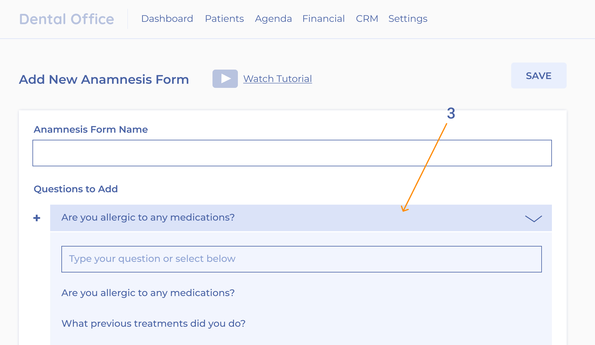
MODIFICATION 3 – Make formularies more flexible.
Instead of a rigid old formulary, the user would work with forms that they could select the fields they would need for a specific case. In this way, the forms would be specified for the clinic with only the questions used for them.
In addition, the user could save the form anytime they need it without having to complete all the inputs.
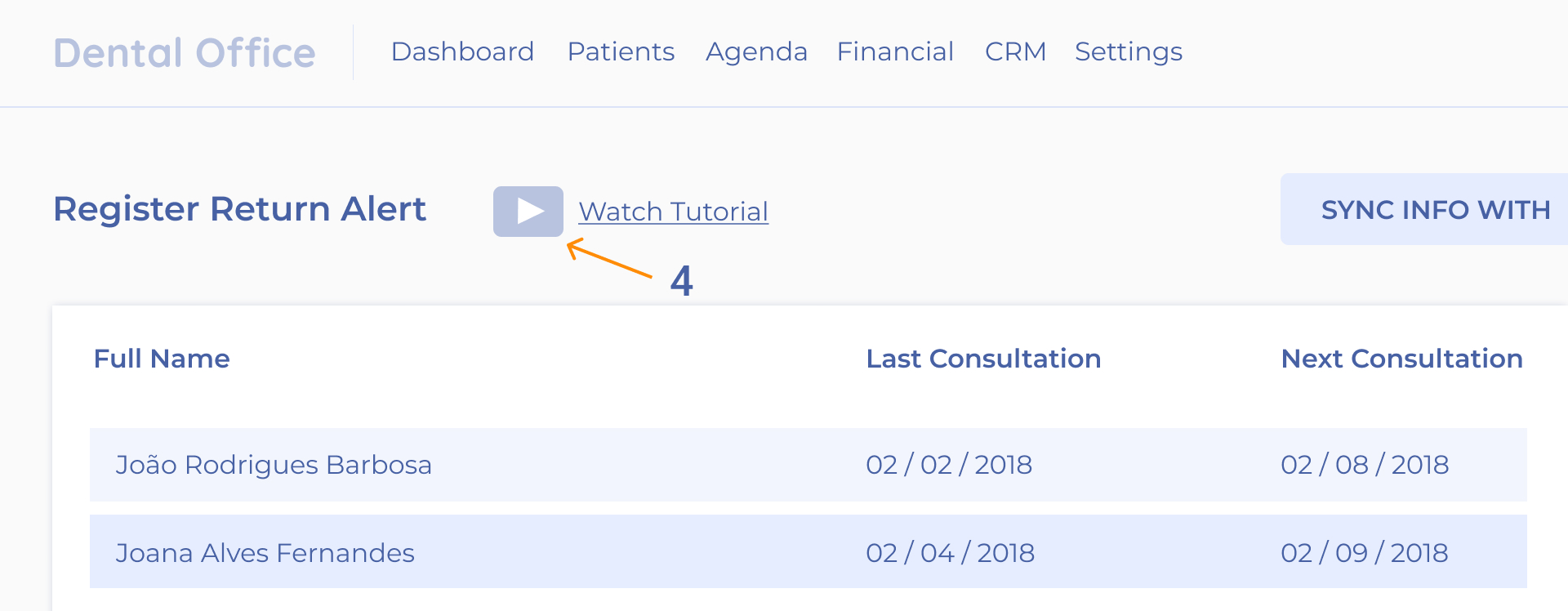
MODIFICATION 4 – Make available tutorials per each task.
When Dental Office launched the last platform version, they made a webinar to explain the new functionalities and to run a demo to teach how to use them.
But of course, watching a webinar is not enough since it has a lot of details, and nobody would digest it seeing at once. Even though the webinar had been recorded, it was a very long video to be consulted.
I suggested cutting the webinar video into smaller ones related to each feature and making them at hand in each specific feature screen. The idea was accepted.
In design debates, I’ve heard people saying that tutorials represent a bad design. It depends. In this case, I disagree. Complex systems comprise numerous tasks, rules, and other intricacies that can be made easier to navigate with the help of video tutorials.
Testing the Low Fidelity Wireframes
Dental Offices’ clients were very participative and helpful, so it was not hard to get some volunteers to test the prototype I created using the wireframes. We did it with 5 participants remotely.
Besides the necessity to make some small tweaks, the user testing demonstrated that the changes were leading the new structure for a much better new path.
The Next Steps After the User Experience Processes
I did the kick-off process for the visual designer of the Dental Office team, who created the high-fidelity design.
All the UX documents were shared and explained to the designer and the developer. Equipped with these materials, they were able to continually stay mindful of the defined problems and solutions, maintain empathy for their users, and facilitate effective decision-making.
The Launch
The changes implemented were launched at the beginning of 2020 for all Brazilian clients. I participated in some moments of the visual design and development to clarify some pending details. Still, I was not involved in most parts, so I took some time away from this project during the high-fidelity design process and the code implementation.
I received an email from the company to let me know that the changes were released, and on launch day, they had already received positive messages from their clients. 🙂
The Result
How we made the user happy:
At the end of 2020, the company was able to realize the turnover it had that year:
- The users finally made their most used tasks without asking for help, significantly reducing support requisition.
- Clients that were upset with the platform changed their minds and kept using it, but not only that, some of them indicated the software for others, which increased the company’s revenue.
- A survey I created that they sent for the clients in the middle of the year indicated that most of the feedback was positive. Besides still some complaints, most of them demonstrated to be more confident using the tool.
- The users felt that they were being heard and valued their time.
How we made the client happy:
Dental Office’s team calculated the impact of the changes compared with the metrics they had in the previous year.
Support Request Decreased by
45%
Increase in New Customers by
10%
Contract Cancellation Decreased by
65%
Thank you for your attention 🙂
If you have any comments, please get in touch at cintiantunes@gmail.com

