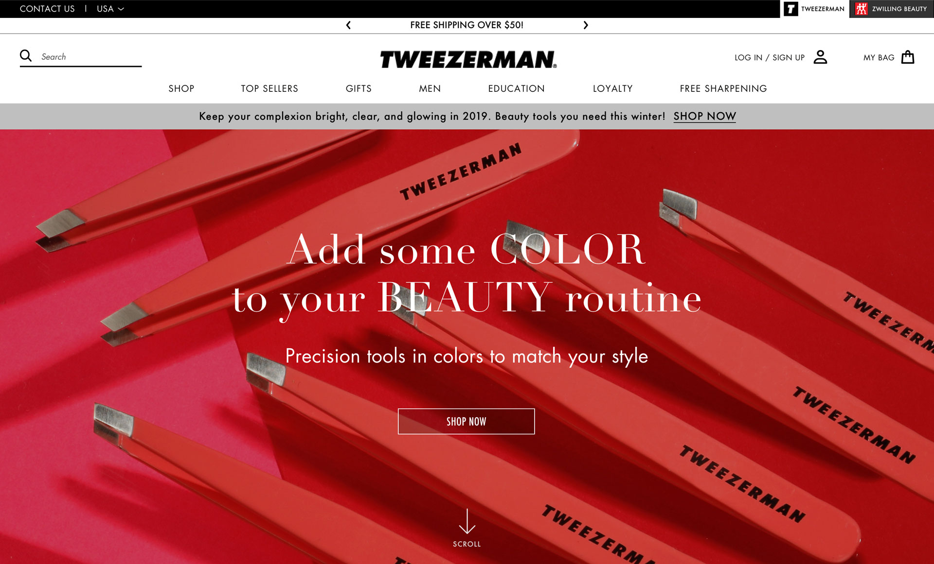
Tweezerman eCommerce needed to improve its transaction volume and revenue. The brand is very committed to quality. The products’ durability makes clients love their purchase, but as a consequence, new orders from the same customer were unlikely due to lack of need. So, online revenue was not achieving expectations. But not only was it preventing the customers from buying. Accordingly, the discoveries made through UX research, a new approach for the virtual store was needed.
Strategic Objectives
1. Increase annual sales
2. Bring the layout up to date
Client
Tweezerman -
Zwilling J.A. Henckels
Year
2019
Services
Strategy
Research
Interaction Design
Visual Design
Awards
Ava Digital Awards
Roles Involved
This project had a lean team for the design phase composed of one UX/product designer (me), a creative director, a business analyst, a project manager, and a tech engineer. All very clever professionals. It was a pleasure to work with them. We worked on this project as employees of the company Redstage.
My Assignment
In my role, I had to understand potential business actions to take and explore those ideas. I was responsible for interviewing subjects, concept sketching, wireframes, creating prototyping, interactions, and visual design.
The biggest challenge of this project was designing an eCommerce that would offer an experience that met the expectations of the brand's loyal customers.
The Beginning
During the discovery process, our team joined initial meetings with stakeholders to understand the whole picture from their perspective.
At this point, we understood what the Tweezerman team had done so far for the website, we got the goals the company wanted to achieve, and we collected clients’ feedback received through their customer support channels.
The Customer is Always Right
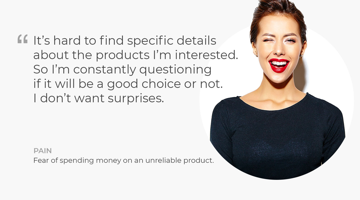
After compiling and organizing the information obtained from stakeholder interviews, desk research, and competitive analysis, I noticed that more data were needed. The gathered feedback gave us north, but there was still a lack of data. We didn’t understand clearly who their main client was; their pains, wishes, and needs were still a vague glimpse in our mind. The redundancy was on purpose.
With the current knowledge we had, in our brainstorming process, we put together our thoughts based on this initial information we got and defined key points to dive further into the user interview to “walk a mile in the user’s shoes.”
So I created a list with questions to interview Tweezerman customers to understand better who they were and to ask about their experience buying online using the current website.
The study's aim:
Comprehend the factors that drive individuals to visit the website and the factors that make them decline to make a purchase.
The Process To Walk On The User's Shoes
The Business Analyst and I conducted these 1:1 remote interviews with 5 women between 25 to 40 years old. The client’s team recruited them.
We got useful revelations that came from the user interview. During the analysis, there was an unclear point, and we needed to invite 2 more interviewers that help us clarify it.
To start the analysis, I transcribed the recordings, putting them together to make them easy to digest for my team and me. Always keeping in mind the research’s first objectives to guide the analysis.
For this type of process, which is very interactive and often needs to go back and forth between the data, it was very useful to use sticky notes on a virtual whiteboard cause I can move them around easily.
Together with the other teammates, I synthesized the findings to draw meaningful insights based on the facts analyzed.
To share our new knowledge with everyone involved, I created a presentation to show the findings and insights and turn them into something actionable.
We rephrased the insights into “how might we” questions to identify design opportunities together.
For the insight:
“Users think that the e-commerce doesn’t update its product range.”
We rephrased it as:
“How might we present the new products in a way to highlight them?”
Also, with the information collected, I made a Journey Map to visualize the process a person goes through to reach their goal.
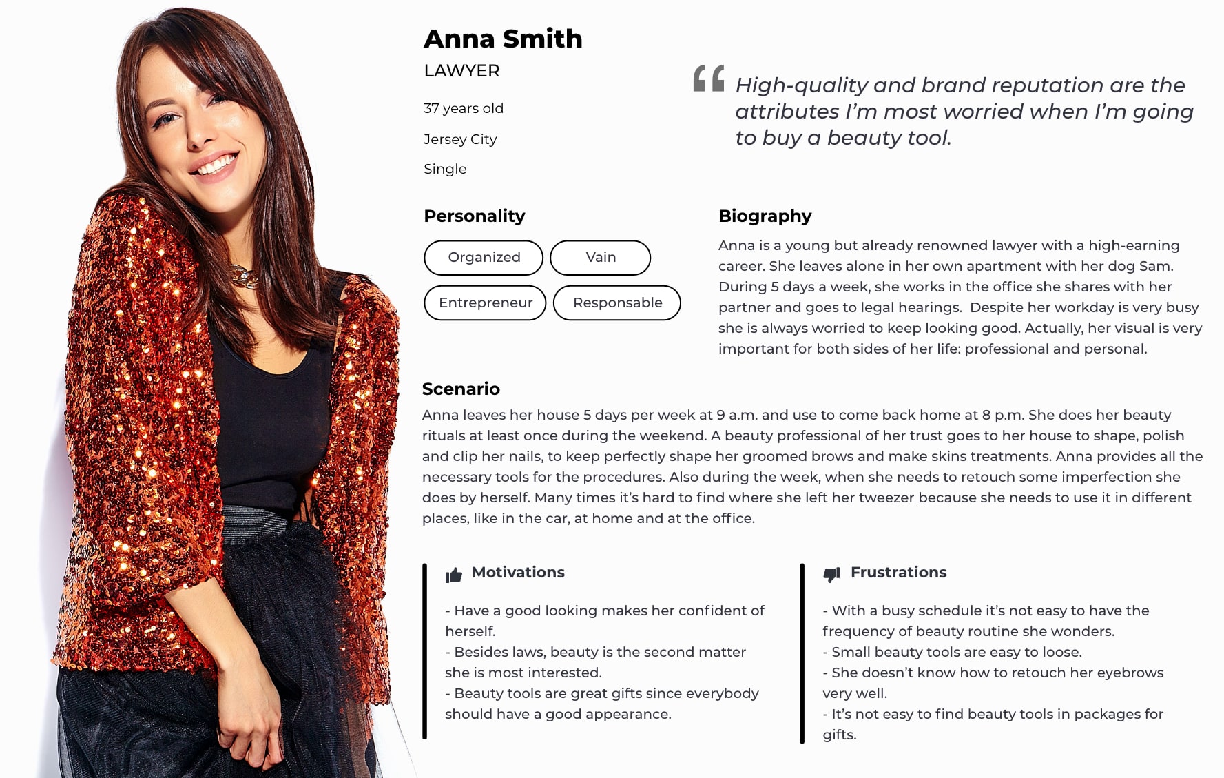
The client already had a Persona document but with a few basic demographic contents.
So I increased it by adding more information about their personality, lifestyle, and possible scenario to give context.
New Design Taking Shape
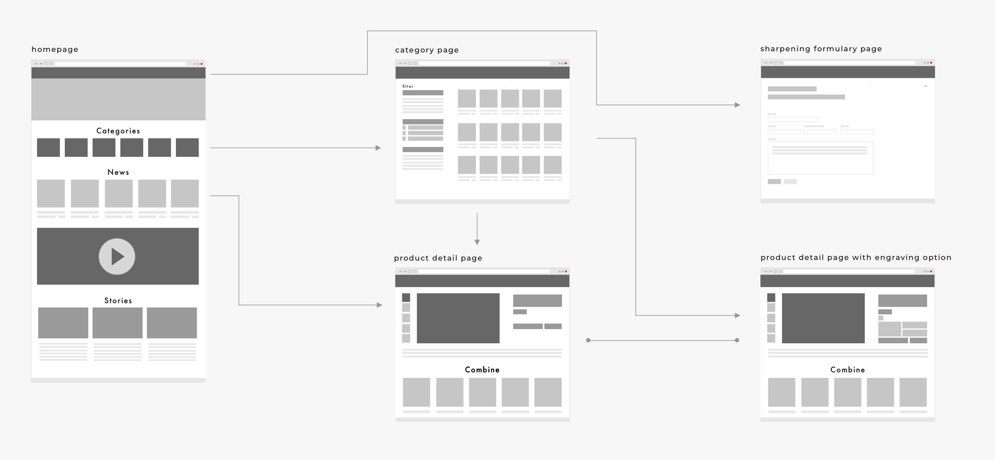
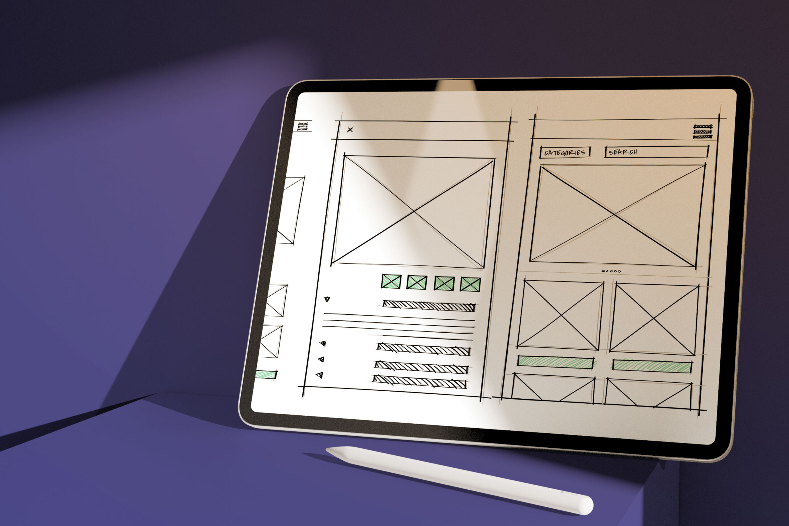
After discussing the concrete user problem with the key stakeholders and our team and defining our actions, we started creating wireframes.
We frequently checked with the tech engineer to understand the technical feasibility we had for this project since it would be built into the Magento platform, migrating from the M1 to M2.
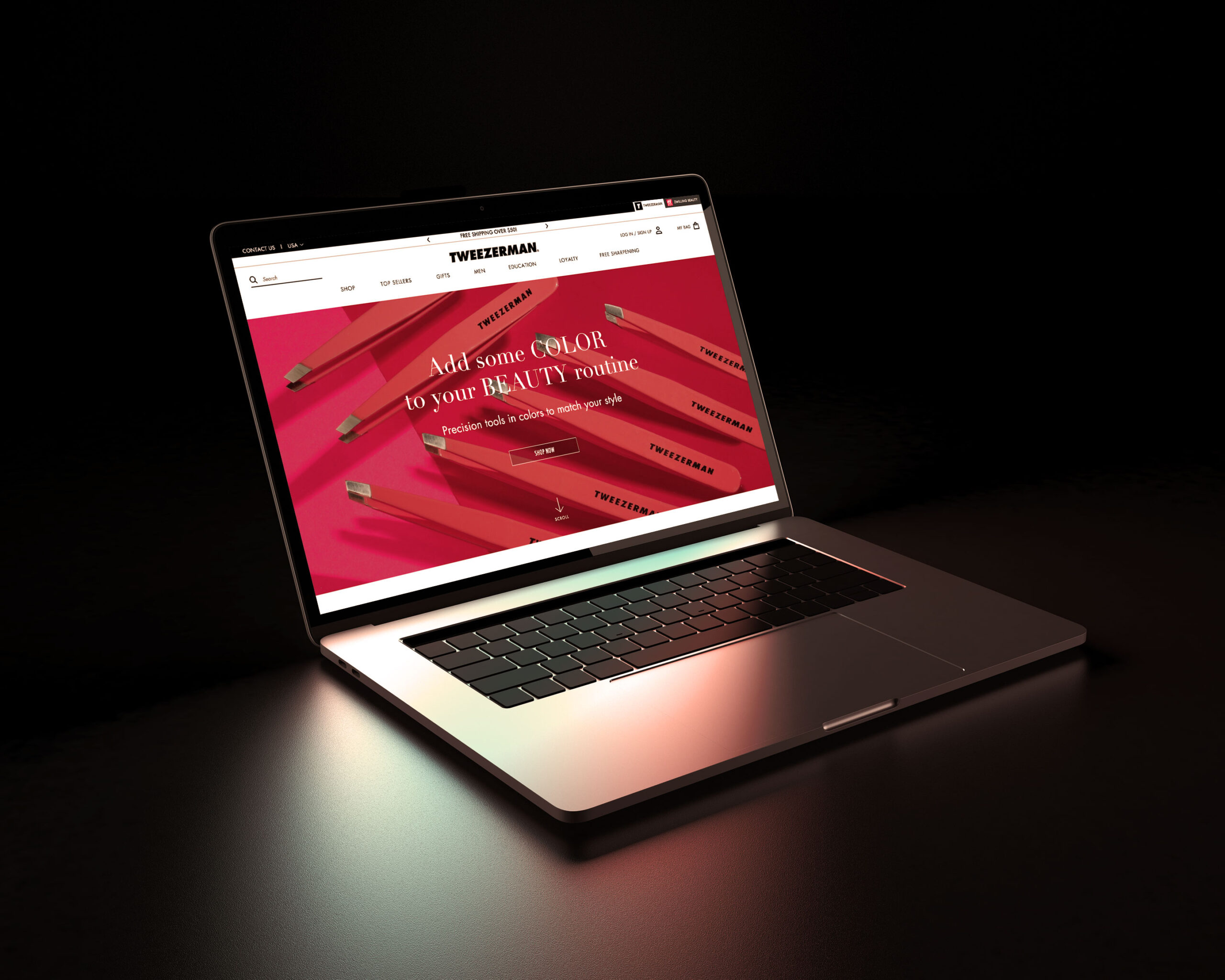
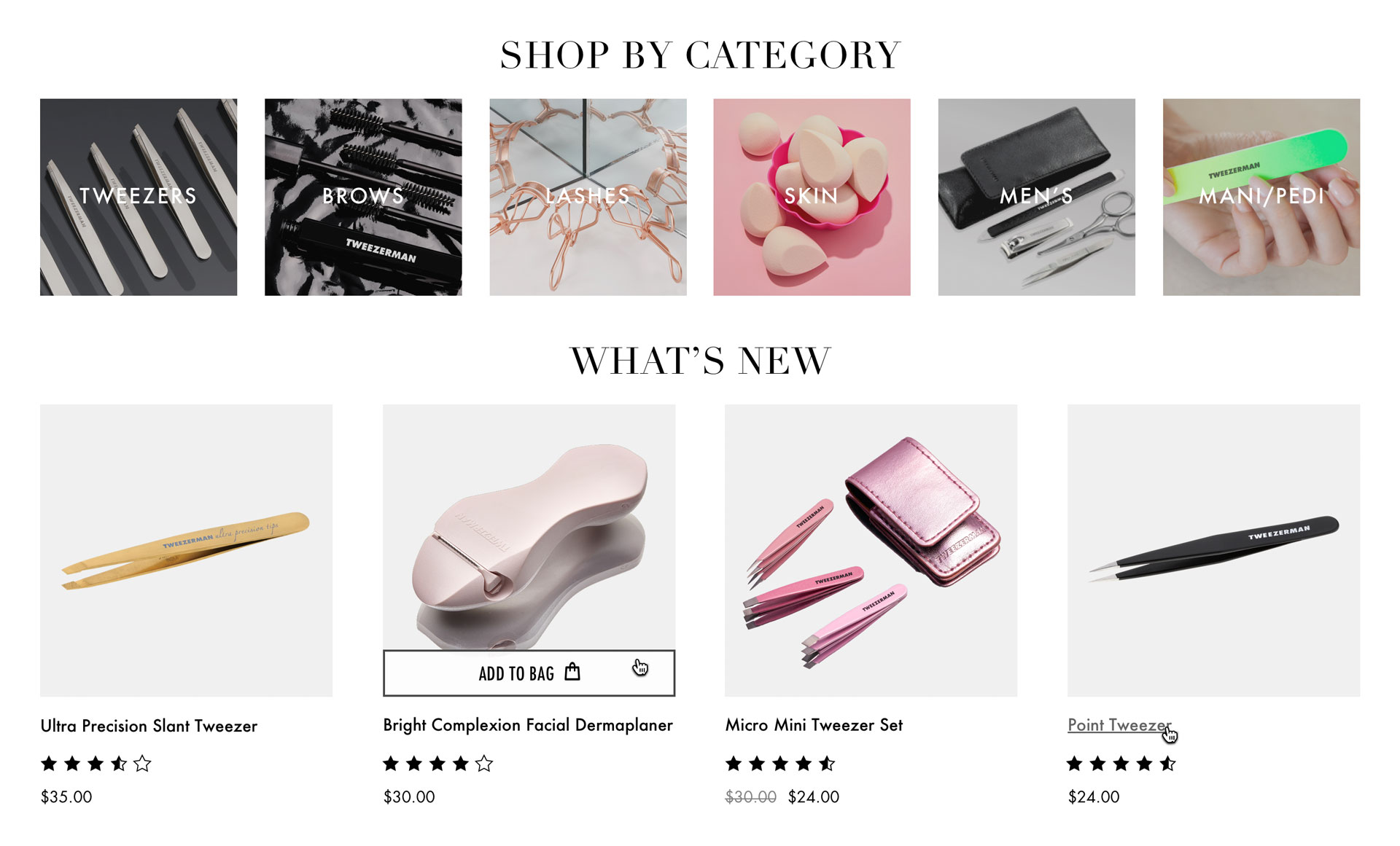
A great call the creative director and I had, which after launch demonstrated to be one of the best actions we took, was to change the menu to display all the available colors for the products.
This was relevant because, as research had shown, the users had the wish to have beauty tools that would match their aesthetical preferences and as already demonstrated by many usability research for e-commerce in general, it is essential to show the range of possibilities the store has to offer right away for the users, so they know exactly what they can find.
Tweezerman Products For Different Moments
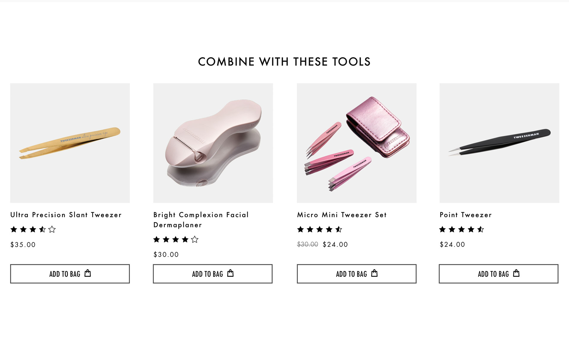
To give the current clients, good reasons to keep buying Tweezerman products, even when they were similar to what they already had, instead of only buying them for strictly routine personal use, we displayed the products to be part of collections or to be a good pick for gifts for the most varied types of events.
To make specific products easier to find, we increased the menu category structure. The improvements were based on the card sorting result and improved search functionalities with more accurate results and filters to make the experience smoother.
An experience as easy as asking a salesperson in a physical store:
“Please, I want a pink slant tweezer.”
Another approach we inserted that is always great practice for B2C virtual stores was to explore the power of social proof offering top sellers.
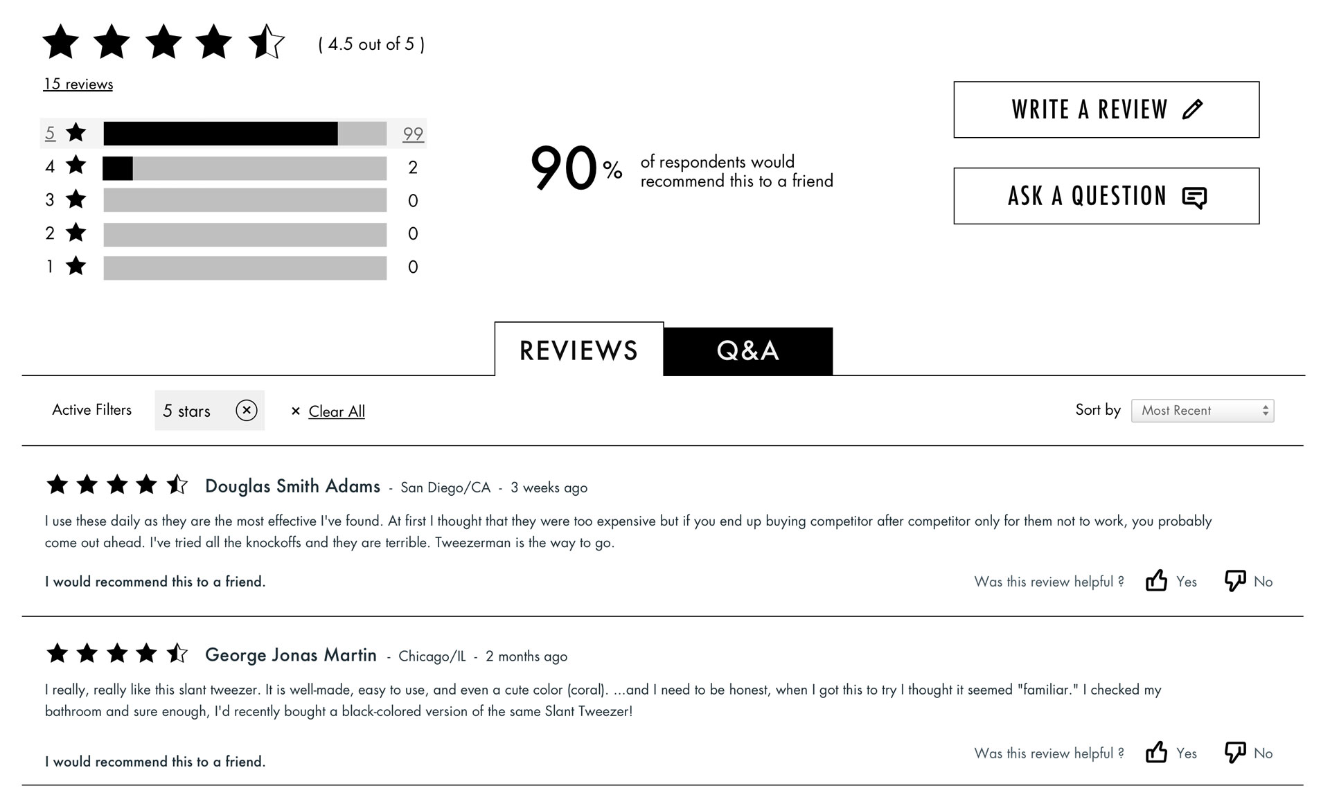
The top seller section on the menu + client reviews on the product page generate good results, easily explained by the normative social influence, that can be used effectively to persuade.
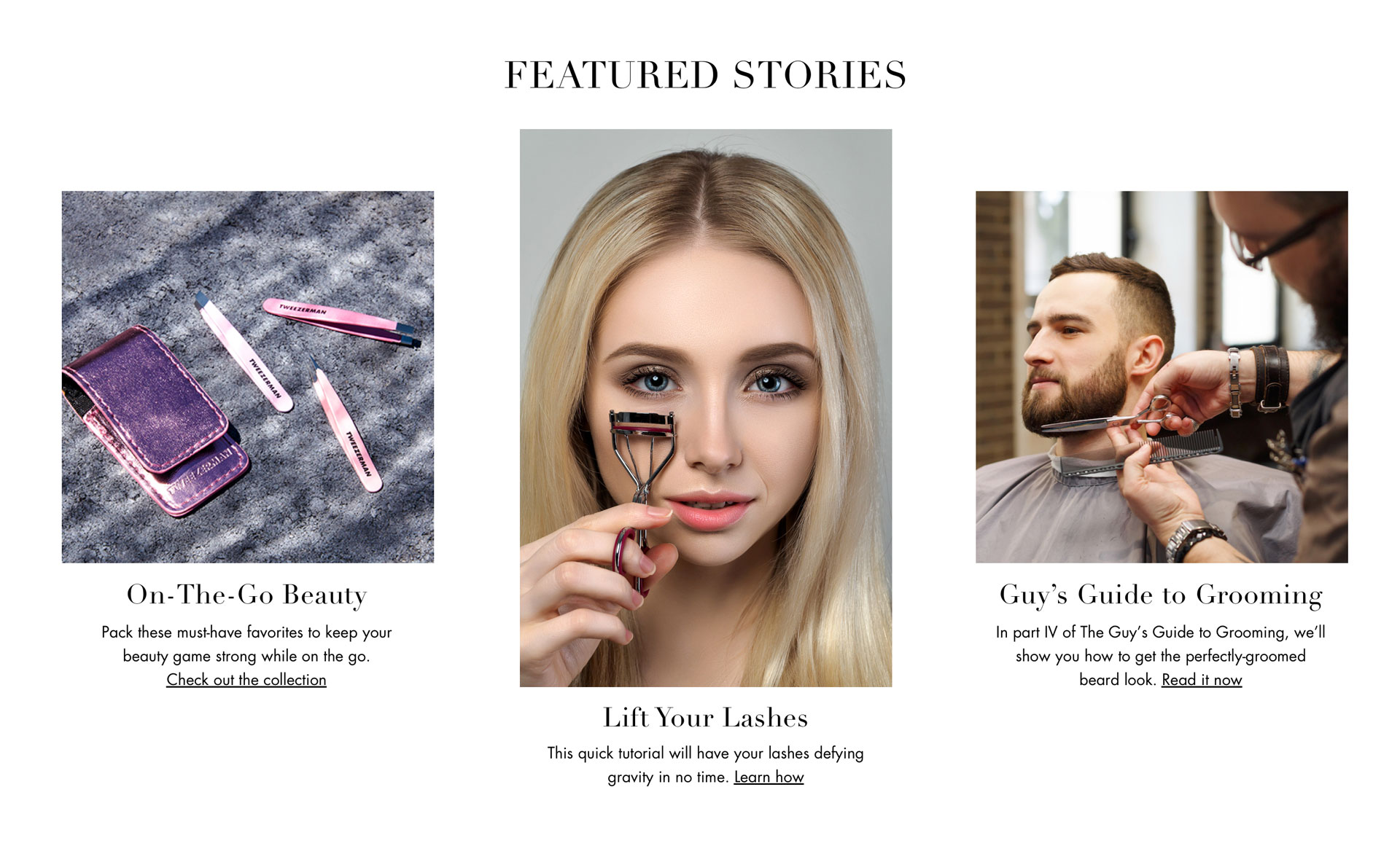
Another key design change was to tell stories to the users and make them connect to other people’s experiences. Using social media psychology, that can affect the brain’s decision-making and emotional processing functions
As long as we developed the ideas, talking to the marketing team of our client was essential so we were able to discuss business strategies and make some definitions: like, the content of the website would always be connected to the social media content.
A website with the right marketing support promoting good campaigns can bring a whole new level of interaction.
With a low budget and strict time for tests, a low-fidelity prototype was used in the guerilla usability test with 8 people to understand how they would explore and find the products they wanted.
After some tweaks made based on the results of these tests, we moved forward to high-fidelity layouts.
A New Layout to Excite the Audie…Dang! @#$!
The first high-fidelity layout the creative director and I created didn’t thrill the clients. 🙁
Although we followed the current brand visual identity and the visual references the stakeholders shared with us, they pointed out some details that were not in the way they expected.
Even though we wanted to transmit the idea of exclusivity and valuable, it should also be connected with a fresh and cool vibe.
We defended our decisions explaining why we took that path but in the end, we agreed with the clients and created some new components to replace the ones that were making the whole layout a bit heavy and not transmitting the required feeling.
After this, the process flowed smoothly.
A New Layout to Excite the Audience
Considering the higher price they charge for the product in comparison with other companies from the same niche, we understood that their UI needed to transmit better a message of elegance, selectivity, and precision. But not forgetting that young and light mood. 😉
Their users need to feel special, receiving an additional experience besides the tool function they would buy. On the internet, the competitors with lower prices are just a click away and the clients don’t have the opportunity to check the products “in loco” to be more thrilled. It was essential to offer something else that reflects the brand’s values.
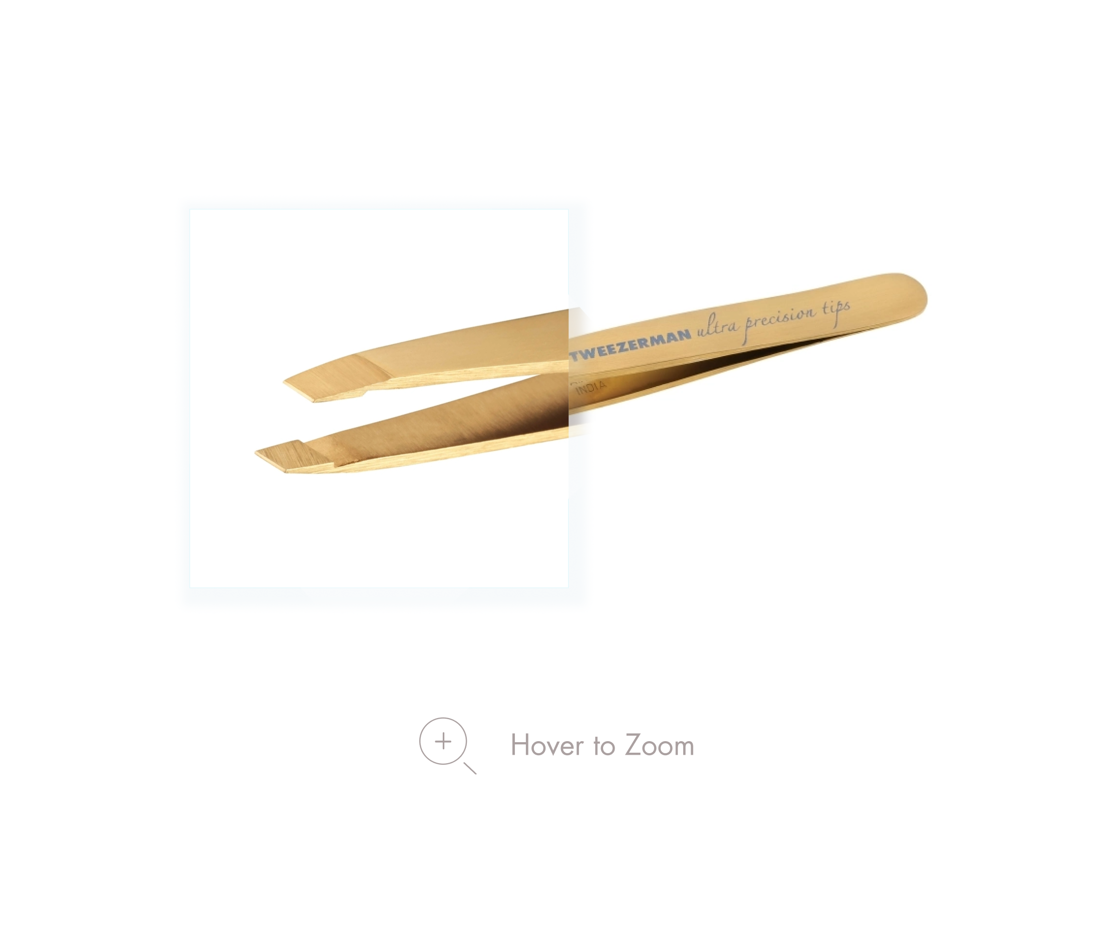
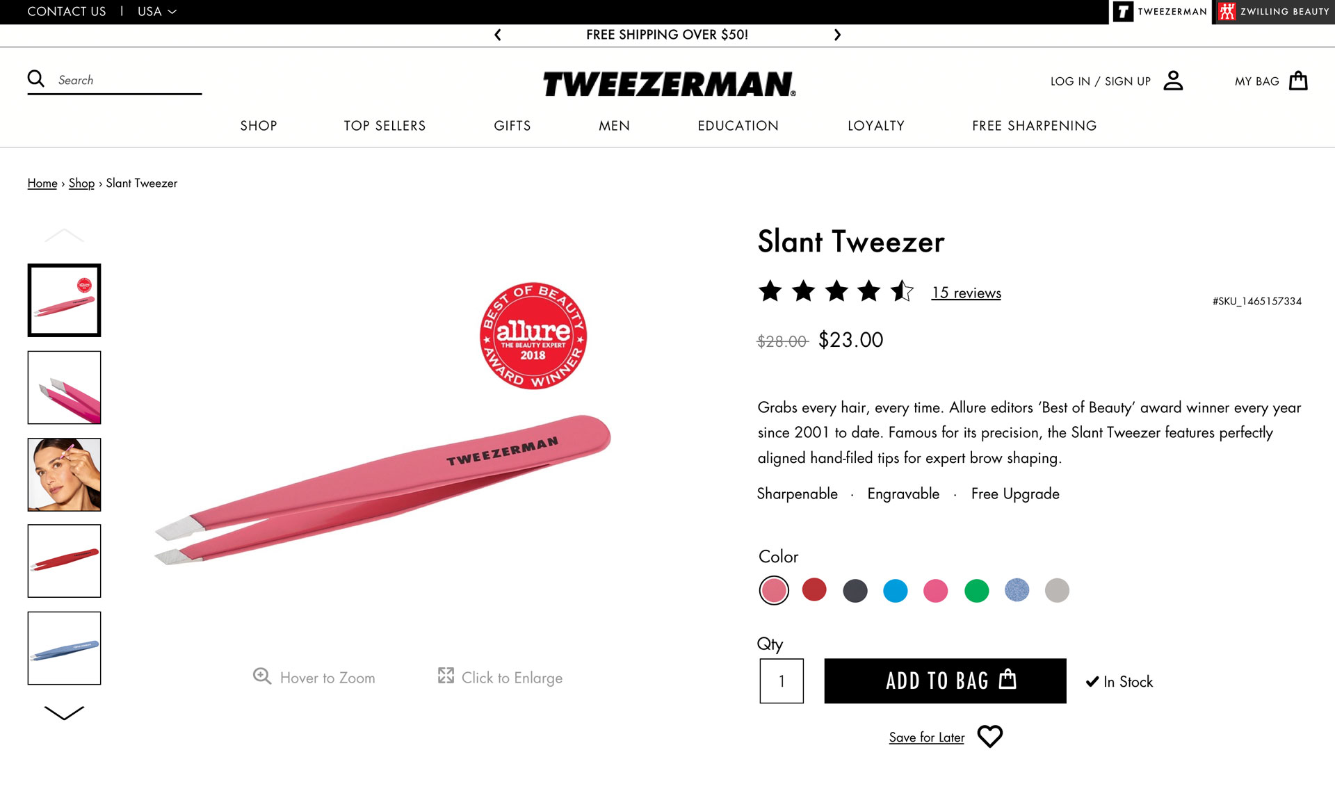
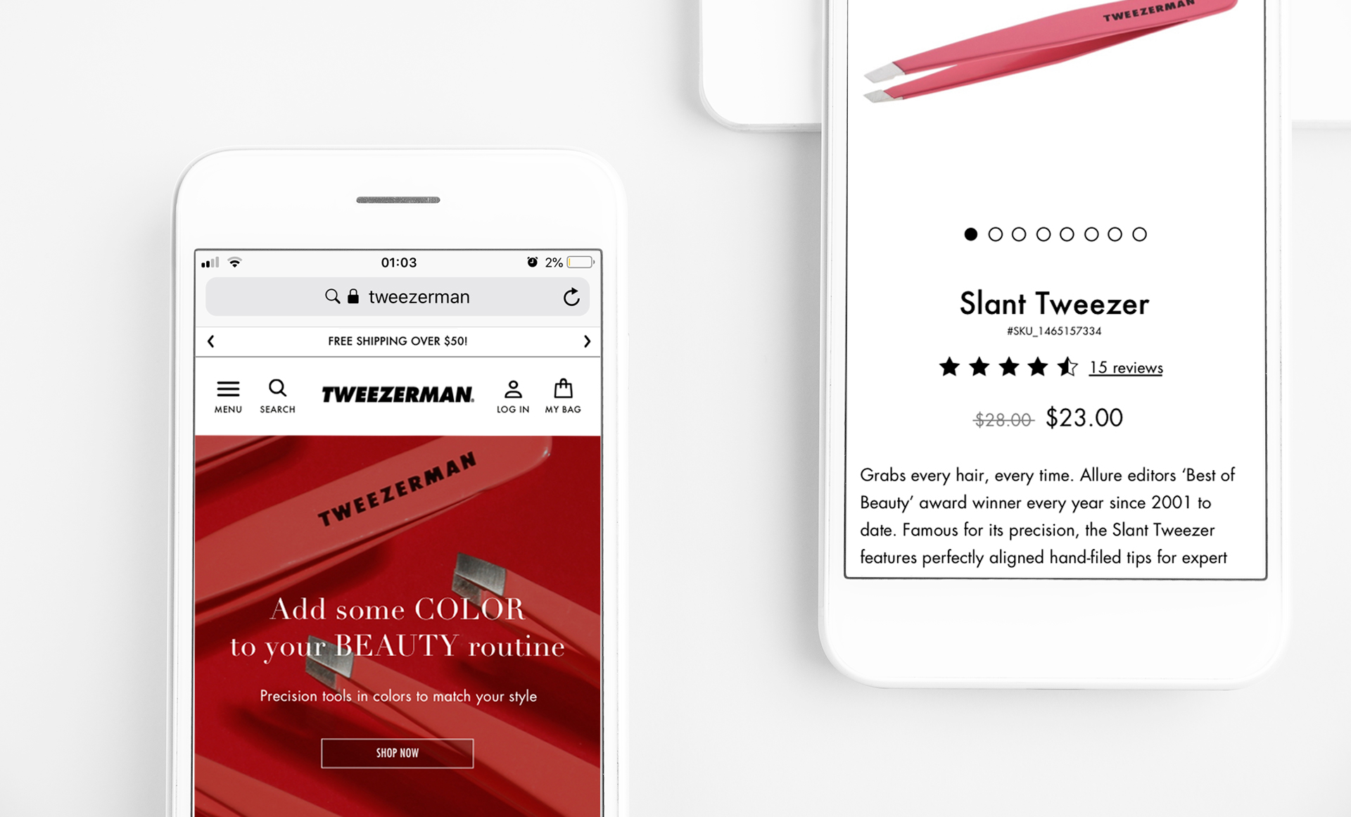
This mention connects me to another thing to highlight: the product’s images and their details. A tweezer is only a tweezer seen from afar, but when the value is added to it, it ceases to be a simple tweezer, to be The Tweezer. The image gallery of all products was increased with high-quality images to show more carefully the texture, the color nuances, the precisely designed tip which guarantees the differentiated result.
Now the products could be seen up close.
High-quality photos allow the users to check the details pretty close. It works with hover on a desktop and pinches on a mobile.
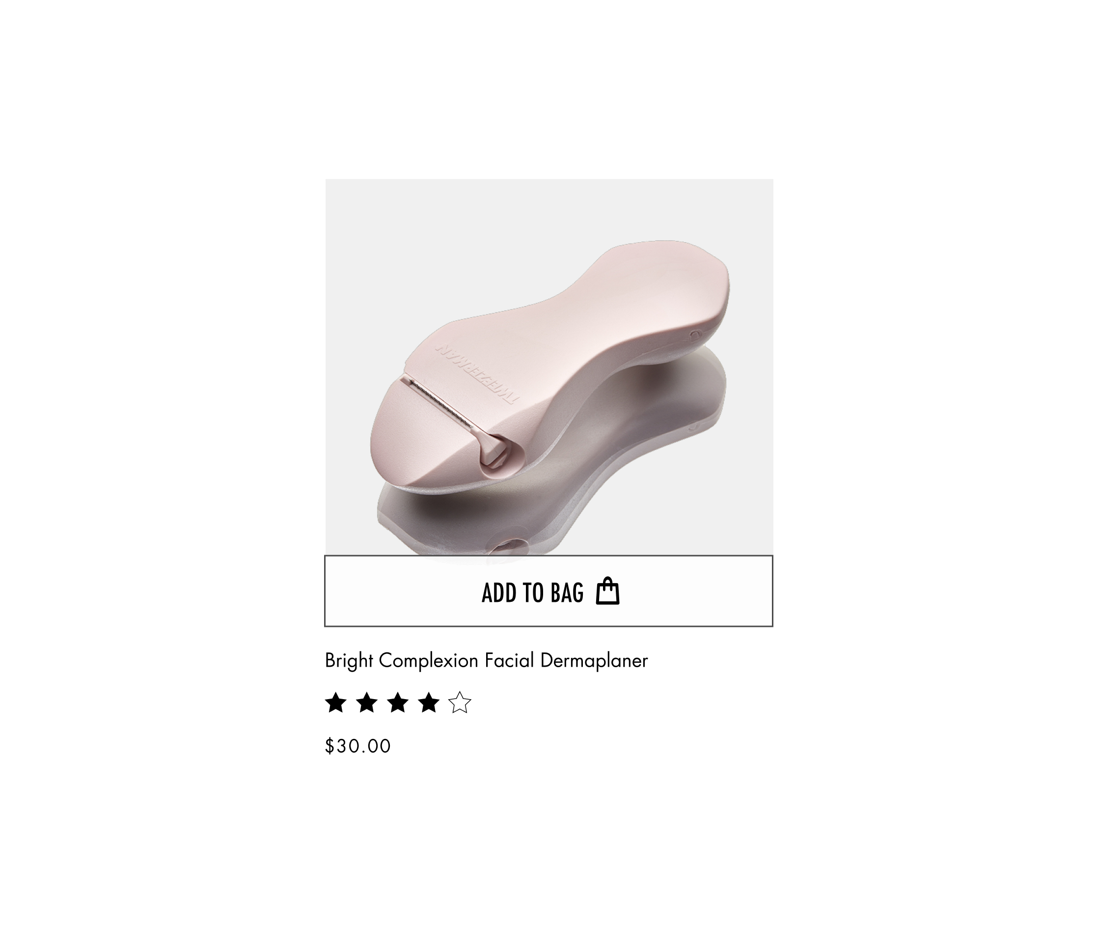
Our new product card features a minimalist layout that highlights the product picture.
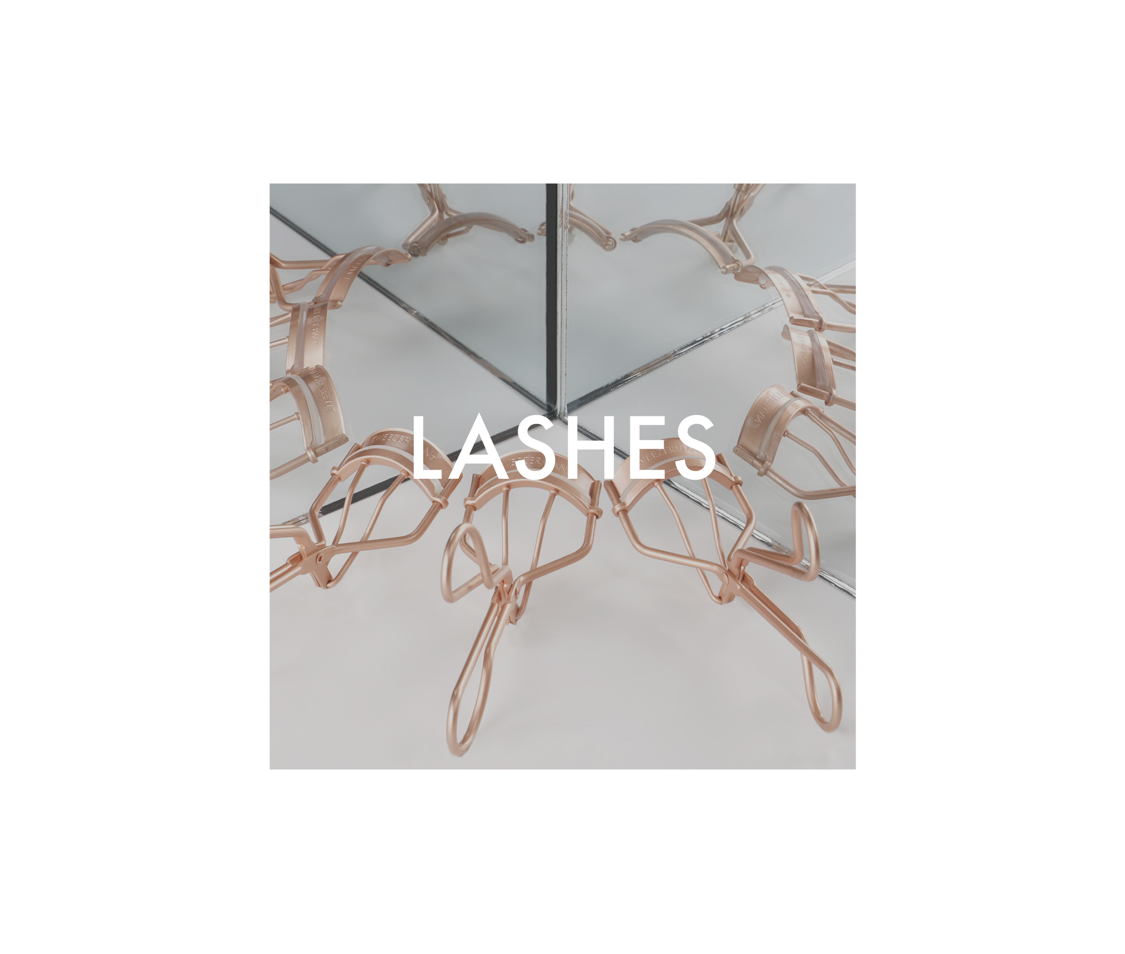
Overlay text added depth and visual interest to the category card while allowing the background image to remain the focal point. This technique was very used in this new layout.
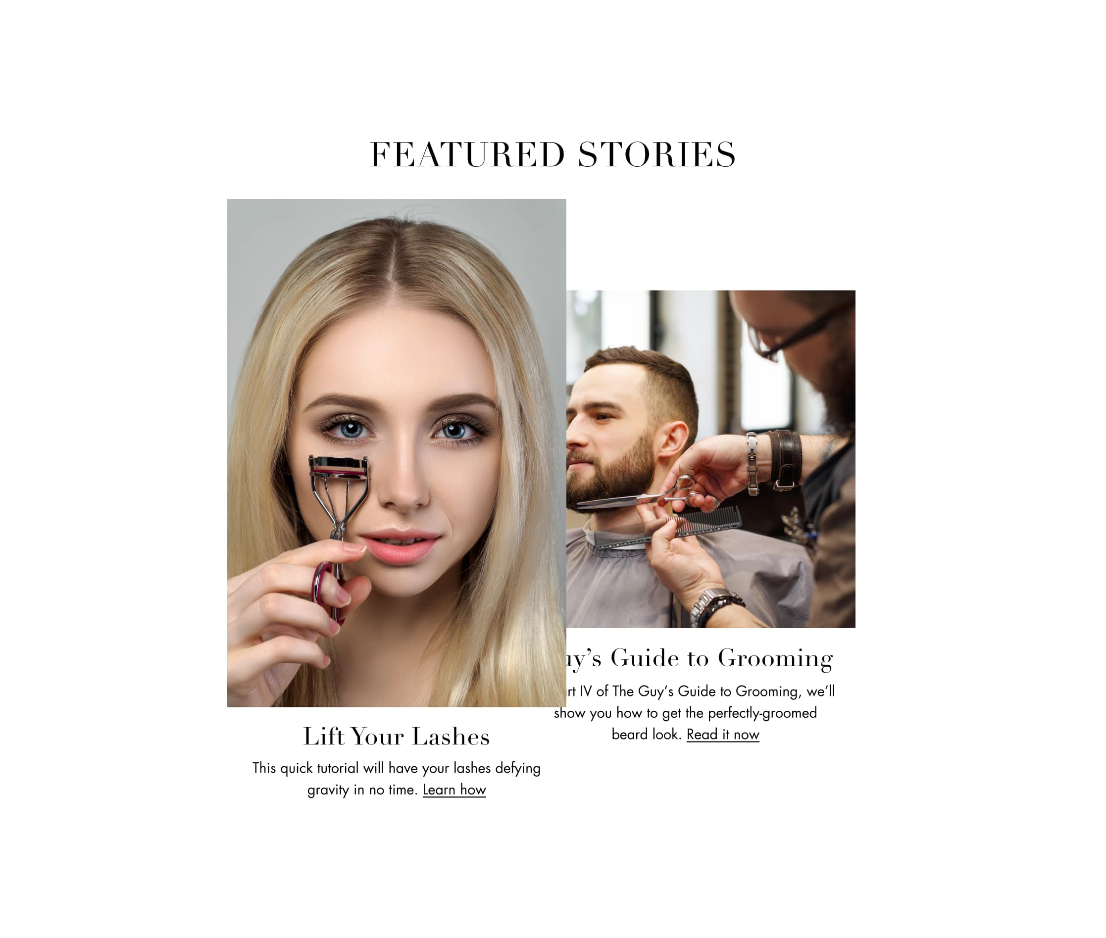
Compelling eCommerce stories connected to social media can drive engagement and traffic by satisfying the demand for more interactive content that makes people curious and connected.
"Simplicity, carried to an extreme, becomes elegance." Jon Franklin
The Launch
After the designs were approved by the stakeholders, we did the hand-off process for the developers with the tech engineer.
We had meaningful great results that exceeded expectations. Even though we focused on improving the experience for current customers, which worked pretty well, we couldn’t help noticing that the rate of new registers went beyond expectations too.
The new website was launched at the end of 2019 (November). With the short-term results, in just 2 months, we were able to measure the impact of the changes, comparing with the whole year of 2018. The users started spending more time navigating the website, finding easily more interesting products that would supply their needs. Consequently, eCommerce increased its page views, transaction volume, and revenue.
The Result
How we made the user happy:
Fans of the brand noticed that the website had been redesign carefully to show more immediately to them everything the company offers instead of making them dig to find out. It makes the person feel that their time is valuable and respected.
Stories and tutorials were added to the home page and always connected to the posts on social media. It allowed people to dialogue with other customers about eCommerce content and strengthen the community that loves beauty tools. It promoted connections and a feeling of belonging.
How we made the client happy:
The numbers below are an estimate. They are the increases for 2019 compared to 2018.
Overall Growth Revenue
43,5%
Average Order
Value
10%
Black Friday
Volume
95%
Transaction
Volume
12%
Awards
This project brought 2 AVA Awards to Redstage! The Platinum Award in the Business to Consumer Website category and the Gold Award in the E-Commerce Storefront category!
Thank you for your attention 🙂
If you have any comments, please get in touch at cintiantunes@gmail.com

